Articles

All about the trade show display… or 10 easy steps to a better one

After 20 years of selling stuff out of a full sized 10×10 display, table top trade show displays just bug the crap out of me.

Church bazaars (no offense meant) set out tables for people to set out the stuff they made and are trying to sell. Professional craftsmen (and professionals in business) spend time thinking about how to best show what they made. They think about the story they want to tell about their products.

Think Tiffany window display vs. T J Maxx windows

Here are a few things I learned selling from a 10×10 booth:

  1. Your display is not only about professionally-made stand-up banners (and I am not dismissing them). But people will NOT read all that copy. If  I’m standing there, wouldn’t you rather tell me a story about your service and how it can benefit me?  Not stand around waiting for me to finish reading?
  2. Put your sign high enough behind your display so as to be seen from the end of the aisle. Why?

    Nobody can miss this business name from the end of the row!
    1. If the sign is hanging on the front of your table, people crowding in front of your booth hide your name with their knees. If it’s high, they can look up and see your name without stepping back to read it. (Allowing/encouraging stepping back signals it’s ok to leave)
    2. The “be backs” (people who tell you , “I’ll be back later”) can look down the aisle and find you.
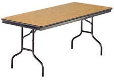
  3. table legs
    This kind works. Other shaped legs don’t.

    Drape your table to the floor. It’s not only hiding what visitors shouldn’t see, it’s also about presenting a uniform clean front view.

  4. Raise your table to counter height so people—especially vain women who don’t’ like to wear their glasses—can see what’s they’re looking at. An easy way to do this is to carry with you 4 pieces of PVC pipe about 14″ long that you can slip over the table legs (IF they have those U shaped legs like the table shown. It won’t work on the legs that are slanted)
  5. Bring something to change the heights of stuff on your table. Covered cardboard boxes (with something heavy inside) allows you to make important stuff higher than the rest of what you’re showing.
  6. Bring flowers or a plant. Have a bowl of candy. Don’t make a candy display that people are afraid to disturb. Get a pretty bowl they can stick their hand in and take a piece or two. Flowers are pretty and attract the eye. A bowl of candy gives a person a reason to stay and talk. People get embarrassed grabbing your candy and then walking away.
  7. If you can have lights (which is less likely at a table top kind of event than at a pipe and drape event) don’t skimp! No lights means no one is home so there’s no reason to stop and look.
  8. Don’t sit behind your table. It’s a barrier between you and your visitors. If you must have a chair (and I am not arguing for standing all day!) bring a tall, bar-height director’s chair.People don’t want to think they’re putting you out by asking you to stand. And why would you want your customers to look down on you?
  9. And perhaps most importantly, think about how people will look at your booth. They won’t see it all at once. They’ll see a piece, a piece, a piece.Think about the story you want to tell when someone stops.
  10. Never start with a question that can be answered “no.” For example: “Can I help you?” leads to “No, thanks, just looking.” And now you have to overcome that negative to get to a positive. How about: “Can I tell you a story about my product/service?” A small first agreement leads to later bigger agreement and sale. Once you know the story you can tell it over and over and be confident. Even if it bores YOU to death, each new visitor will hear it for the first time.

If you’re looking for ideas, visit any high end craft show and pay attention to the booths. (It’s a cheaper experience that way, but the craftsmen might not like it much!)
[kerch]

A portrait is more than just a picture

guy on the phone

It might just be me, but I’m getting really tired of looking at websites with pictures of people that I just know are models. They scream “FAKE” to me.

I’m also tired of  pictures of people that look like they lined up at a photography studio in the mall and got standard head shots.

Business is about the relationship. It’s hard enough to build one when you’re sitting across a table—face to face—with the client. But when you’re miles away and maybe you’ve never met, a good photograph is a really important.

Many people do judge a book by the cover.

Your photo on a website or a book jacket is an opportunity for your client to identify with you or imagine what you might be like in person. On the most basic level, it is an opportunity to know that you are a specific human with only one head and no third eye.

Your portrait begins to make a connection with people you may never see. It conveys a certain look behind your eyes and tells what is important to you.

But a good portrait is more than just a photograph—a dispassionate representation of a face. Your portrait begins to make the connection with people you may never see. It conveys a certain look behind your eyes and tells what is important to you.

When you prepare for a portrait session, spend some time thinking about your ideal client. If you had to dress up to meet that person, what would you wear? What would you say—if you couldn’t talk to him? Your portrait must tell that story.

Also think about the rapport you’ll need with the person on the other side of the camera. S/He won’t be nervous. Try not to be self conscious.

If the photographer is really good, you’ll be at ease and probably know the best shot when he takes it. But if he’s not so experienced, you’ll have to work at presenting the face you want to use.

What is your look?

People are generally most comfortable in groups of people who look like/feel like themselves. So match your photo to the clients you want to attract.

It will be your face with which people will connect, so be careful of a full body photo. But you might want something else in the photo with you.

If your dog is really important to you, why not have him in the picture with you? Check out these photos of people who work for Specialties in Wool . They are all real people and their photos show that clearly! The pictures help buyers connect with the people who are making their custom knitted Christmas stockings.

Pretend these clip art photos are real life coaches

How does your image measure up within the rest of the people in your industry? That’s what you’re going for here.

regular man with a tie

This is a standard photo of a man who could be a coach. Clearly, both he and the photograph are professional. He seems friendly but you can’t tell much more.

happy man with a tieHere’s a guy who might also be a coach to professionals. But I feel like I know more about him. From the frames in the background, I think he’s got some kind of training. And it looks like he’s easily talking to someone sitting across from him. He’s comfortable.
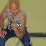
guy with weights

Is there any question that this guy works with people who are trying to be fit?

smiling young man
Or that this guy is hip and doesn’t believe he is the center of the universe?

What says “fun” better than puppies?

This guy clearly likes to have fun. I want to work with someone who’s having fun. But then that’s my value and maybe not yours.

A couple of final tips on the process:

If a friend is shooting your pictures, take many more than you need so you’re sure to find one you like.

While a plain background is considered norm, if you love to garden, maybe that’s a better place to do the work.

If you use a professional photographer, have a discussion about copyrights before he begins work. Yes, it is your face, but he made the art. So get him to sign over to you the copyrights to the image. Or if you choose to let him retain the rights, negotiate the fee structure for future use—both yours AND his.

When choosing the final photo to use on your website, check it out on your monitor at about 150 pixels wide. Monitors can’t really render much above about 72dpi, so there’s no point in saving the photo at 300dpi or greater. Print is a different story.

This article was originally published in Circle, the newsletter of the ADHD Coaches Organization in April 2006.

How do I make my PDFs smaller?

Small bug on a big flowerWhat happens when the PDF you want to send is just too big?
How can you make that PDF (or an image, for that matter) smaller?

I got a great question about file sizes from a reader today.

The file size of the current issue of my church’s newsletter is too big to upload via WordPress. So can I use ftp to put it in a new folder and just link to it?

Or is there an easy way to reduce the size of a PDF?
Do you have to make the images smaller you put in it? or the number of photos? or run it through some compression? or?

Not only does uploading a big file to the internet make WordPress choke, but remember: the time it takes to upload is directly proportional to the download time.  Smaller images will definitely help!

Uploading does generally takes longer. But if the file is too big for WP, it’s just plain too big.

Let me ask you, just how long will you wait for a file to download before you decide you don’t really care that much anyway?

If your reader doesn’t even download the file, none of your content has any value anyway.

So here’s my answer, with first a bit of background

Think about images you make on your digital camera (or even phone!).  If you don’t know anything about these things at all, it’s all about the number of dots that can be squeezed into the space. And for sure you’ve been taught to know that 10 megapixel camera is MUCH better than a  2 megapixel camera.

Also, what happens when you try to attach an image you took with your phone to an email? My phone asks me to choose the image size: small, medium, large, and full size.

And if you load one of those giant photos onto your computer, have you noticed how long it can take to show the whole thing? It’s sure more than instantaneous.  That’s because the file is HUGE!

So what can you do? Edit the image size!

You could just use the image editor that’s part of WordPress (or MSWord, for that matter) to drag the corners and make the image the right size. The problem is you haven’t actually changed the size of the photo. The original giant photo in still in that file, just shown at the size you want. That’s easy and works great if you don’t care how big the final file is.

But reducing the size of the PDF is what we’re headed for.

Here are some suggestions to make your PDF file smaller

1. Use fewer images

Do you really need 6 views of your wedding cake in your Holiday letter? I’m guessing, in reality, nope! Just pick the best one. (Your friends REALLY don’t care to see all 6!)

2. Reduce the size of the photos you do use

  • Start by making the photo the actual size you want to use.

You don’t need a fancy graphics program to do this.

I like to experiment with the actual sizes so I use Irfanview. It’s free, loads up fast and is powerful enough to massage the size of the photos. It actually does lots of stuff and it’s pretty intuitive. Preview will probably work for a Mac.

Make the image bigger and smaller. But remember (or FYI) you lose a little quality in the image with each resizing. So for the best quality, when you’ve decided on the final size, go back to the original giant image and make the reduction all at once.

  • Pay attention to the resolution of the image.

Here’s a file size comparison

Bigger numbers mean bigger files

Image Image size File size
Full size image @ 300 dpi 8″x10″ 1664 KB
Same size @ 72 dpi 8″x10″ 77 KB
Right sized @ 72 dpi 3″ wide 36 KB

That’s a 98% reduction in file size just for picking the right sized photo!

Printed images generally require a resolution of at least 300 dpi. And that makes big files. (It might be a small image size, but the file is big. Make sense?)

Most computer screens can only show images at about 72 dpi. So if you’re making a file that will only show on the screen, and you’re aiming for a small file, then high resolution doesn’t buy you anything. Set the resolution of the image to no more than 72 dpi.

  • Consider Form vs Function

If you are producing a document suitable for framing (so to speak), you want the highest resolution you can manage.

But if that PDF is likely something people will read on the screen, or print out, read, and then toss, is magazine quality photography important (and do you even HAVE magazine quality photos in the first place?)

  • Test to see how low a resolution you can tolerate in the final product.

If you’re putting this low resolution image into a document that will be converted to PDF, print yourself a test copy and see if you can tell the difference. If you can’t, maybe you don’t need such a magnificent image.

And if you figure people are just printing these out at  home to read and toss? I’d use 72 anyway (or perhaps 90  although I wouldn’t bother)

  • Other ways to reduce PDF file size

Check the PDF printer settings. Select the one for “Smallest File Size.”  Again, print yourself a copy from the PDF and see if it meets your needs.

Save with the file as few different fonts as you can manage when you save to PDF.  On a general low end program that does “Print to PDF” you probably can’t control that. But if you can, then just take what you need.

Does this help?  I hope so.
Have questions? Please ask.  There’s a big box for that below.

[kerch]

What is a “404 Not Found” error anyway?

If you’re lost, don’t you want help to find your way? That’s what a good 404 Not Found error can do.

404 error sample

I know you’ve come across pages like this while searching for something really important (or not).

When I stumble on one, especially in the middle of some beautifully designed site, I feel like I’ve been slapped in the face. Everything else was lovely.. or at least had some color and some visual connection to the rest of the site.  But this is just plain UGLY!

What is this “Not Found” error message?
And why did I wind up here?

It could mean, that there used to be some content at this web address but there isn’t any more.

Maybe the web guy moved the content to a different place and didn’t leave a forwarding address (How Rude! And yes, you can use a forwarding address. That’s generally called a 301 Redirect but I digress)

It could also mean that:

  • A bookmark or favorite you  used is out of date.
  • Sometimes a search engine link can be out of date.
  • Maybe there is a broken link on the site itself.
  • Maybe you just typed the address wrong or copied it wrong.
  • If you got the link in an email, the link broke while being sent. (That often happens if the link is very long and gets broken in parts to fit them on the email page)

But whatever the reason, that generic Not Found 404 Error feels like a slap up-side the head. AND it’s not helpful.

What’s a site owner to do?
Make a custom 404 page that’s useful to your visitors

Think about if you’re on a car trip and you figure out you’re lost.  What do you do?

If I had put my life in the hands of “Jill the B.. in the box” on the dash board, she would already tell me, “Recalculating!” (I, however, rarely listen to ethereal beings, while some other people who live in my house just might be having an affair with that wench!)

  • But  on my own, I’d like a paper map (The site map does that job on a website.)
  • I’d like to be able to go back to where I was last and see if I made a wrong turn (Use the back button)
  • I’d like to ask somebody on the street (Use a search box)
  • Or, I’d just like to go home and ask my mother where I made the mistake (Hit the home button)

There are lots of creative 404 pages out there. Check them out over at Smashing Magazine or at WebDesignLedger.com

Some of these pages are just cool but not particularly helpful. But others are both.

What I’m asking you to do is think about what belongs on your “Lost in Space” page. And make it useful!

[kerch]

6-year-old’s Marketing Video… Beautiful!

I feel like I must be a hundred.. but back in MY day, the Boy Scouts sold light bulbs!  THAT was useful.  My dad would keep a big list all year and then get them from a neighborhood kid.

Now, at least here in Baltimore, they’re selling popcorn.

A friend of mine has a 6 year old son who is very proud to have just joined the cub scouts. His den is selling popcorn. “He” wrote an email to his friends and relatives (using his “daddy’s email”) to ask them to buy popcorn.

OK., that’s pretty standard fare. And pretty easy to ignore if you are not ACTUALLY the grandmother (which I am not).

However, it looks like the scouts have upped their game for selling stuff because now using the link in Jack’s email, I go directly to a page which gives him the credit when somebody buys something. (Only problem here is I know the kid as Jack, but his real name is Jonathan.. and that was a bit confusing. Particularly as the picture on the page isn’t Jack).

But I digress.

Here’s the really cool part!
Jack made his own video to sell the popcorn.

And THIS, I am quite sure, he did on his own. The video (just a minute and a half) is a riot sure to impress not only grandparents but friends of his “daddy’s” as well.

It’s short. And feels like marketing genius to me. Only thing I would have suggested, is to put the video link up higher in the letter. And make some reference in the video to the cost of the popcorn and where to find the link to buy the it.  But hey, there’s always next year.

But buy some popcorn from this kid today! The fund raiser is over the end of September.

Are you wasting time on your business website?

man with beer having funDid you ever notice how all those beer commercials at the Super Bowl are about good times? “Miller time” isn’t about cheap beer.

According to research from Stanford University, customers have more favorable feeling toward brands they associate with “time well spent.”  Memories of good times were more powerful than memories of great savings. 

Ultimately, time is a more scarce resource—once it’s gone, it’s gone—and therefore more meaningful to us,” says Mogilner. “How we spend our time says so much more about who we are than does how we spend our money.

So here’s my question to you:
Are you spending your time worrying over your website and it isn’t even fun?

Yes, yes, I know, you gotta work.  BUT do you have to work at something you don’t or can’t do well?

Fifteen years ago when I was in a different business, I spent hours trying to take care of my books.  I was a freakin’ math major in college! Numbers don’t scare me.  But it wasn’t the math, really, it was finding all the receipts and putting them in the right columns on the spread sheets.

I was spending HOURS doing something I wasn’t good at and at the expense of something I  WAS good at: making art!

When I got my first book keeper, I thought I’d died and gone to heaven.  Bills got paid, invoices were sent, and I wasn’t panicked about something I didn’t do.

Now let me ask you about your website.

  • Are you satisfied with it?  Look and work like what you want it to?
  • How much time are you wasting worrying over it? Or trying to tweak it to be what you want?
  • Is that time well spent?

Maybe your site is not as bad as you think.  We could talk about it. Send me a  note. Let’s plan for a strategy session.  We can figure out together what needs to be done.

Let’s talk about it

[kerch]

Is my web designer going to get me a real website?

Did you ever get one of these shirts after somebody’s vacation.  “My mom and dad went to Hawaii and all I got was this lousy t-shirt?”
I recently found a note like that in the comment section of my survey about working with a web developer. (The note is changed slightly but not in essential content.)

I’m tech challenged. I hired a web designer: Wonderful and talented. Took several attempts to get my essence and energy. I finally got a design I liked for style reasons. She called it a “mock.”

Then I found out that there really was no site there, just a pretty picture of what my site WILL look like, if I pay more money for a web developer to write the code. Boy am I frustrated.

There is no test to determine if a person is called designer or developer.

This seems to be a fairly common problem. You want a new website design. So it makes sense you’d look for a designer, a person who can figure out your look, or brand, and decide where all the pieces of your website should go. That’s what designers do. They design.

The designer might think s/he’s done after sending you the picture.

In that case you’d also need a developer who can slice up the image to put it into a workable format to use on line. Your designer may work with a developer (code writer) regularly and may pass you on to that person. Or perhaps the final, coded website is part of what you bought.

There is no test to determine if a person is called website designer or website developer. And there is a pretty murky line between the two anyway.

  • Some people call themselves designers because they figure out where the pieces of your website go and put them there.
  • Some people call themselves developers because they figure out where the pieces of your website go and put them there.

Confusing, huh?

So here’s the bottom line:

Ask the person you’re thinking about hiring about their end product.

  • Will there be code behind it? Or will that be a separate process?
  • Will they find the developer or will you?

Either answer is OK. But you have to know going in what you’re paying for to avoid surprises like the poster above.

You sure don’t want to agree to pay a bunch of money only to find that you didn’t get what you thought you were paying for.

Make sure both you and your WebGuy are on the same page.

Signup for my newsletter and I’ll send you  7 Questions to Ask When Interviewing a New Webmaster/Developer/Designer/WebGuy.

  • Are you sure you spelled it right?
  • This field is for validation purposes and should be left unchanged.

Then ask the questions!

And let me know how it works for you.

How hard is it to tweak a WordPress website?

Let’s say you’re new in business
and you know you need a web site.
Good for you to know that!
Let’s say you also think it should be simple.

Let’s say your brother/cousin/neighbor says, “Oh, that’s easy. I can set up a WordPress site for you in a couple of minutes. Just pick out a theme, and I’ll tweak it for you.”

You say, “Great, thanks! Let’s go.”

Then your ask your “webguy” (who may also be a gal) to  make some  tweaks: change the colors here and there, add  some functionality,  change the header, add some stuff to the footer, see what it would look like with a red line across the top.

The upgrade process
will probably
take more time and
cost more money.

If your webguy isn’t really top flight, while he may be able to make those changes, if he doesn’t make appropriate comments in the code which neither you nor your visitors will see, when you decide to change things you could be in for a big surprise—heck, he could be in for a big surprise when he can’t remember what he changed and where.

After a year or so (or maybe less) goes by, you decide you’re ready to upgrade.  You may think, “Hey, I already have a WordPress site, so this should be an easy-peasy job to make the changes I want.”

Only it’s not so easy-peasy.  And that process will probably take more time (read: more money) than building the site did in the first place—especially if your  brother/cousin/neighbor  did it the first time for free or almost free!

Each different theme author  could, for example, name different parts of the design with differently. So your new “guy” will first have to decipher what the old “guy” did before any changes can be made.  If the theme you chose was not well written in the first place, it could be even harder to figure out.

How can you minimize the headache of adjusting to your second website?

You do need a website, to prove you’re a real business. It doesn’t have to be fancy.

So here’s my recommendation:

  1. Let your guy set up a WordPress site using one of the popular themes (which is, therefore, most likely to be bug free)
  2. Make as few changes to that theme as possible.
  3. Add as few plugins as possible:
    1. Akismet for spam protection in your comments,
    2. A form generator for your contact page (I love GravityForms!) and, of course, your content.
  4. Then leave your site that simple for a while. Work with it. Add content. Think about what things you wish it did.  Explore the sites of other people in  your business.  Make a WRITTEN list of what you want to change and what you want to stay the same. And then, ONLY THEN, find a REAL WordPress Person to adjust your site as necessary.
  5. Finally, ask if it would be cheaper to start from scratch or fix what you have.
  6. Ask for a written proposal including language about what happens if the “guy” finds that the process is more complicated than originally planned.

We specialize in fixing broken websites. So if you want what you have (or almost) but you want it to do more, then contact us for a complimentary strategy session. I’ll be able to tell you, in probably less than a half hour, about the process and what you should do to be ready for it.

Here’s what I’m thinking about

[widgets_on_pages id=”archives”]

Here’s how it’s all laid out

I’ve divided my thoughts on all things related to my work on websites and what I think other people should be paying attention to on their websites and in their relationship with their technology into these categories.

8 Ways To Break Your Computer

Smart people generally don’t like to admit when something baffles them. And competent people don’t like to admit being afraid of inanimate objects.

In fact, computers can’t do anything you don’t specifically tell them to do. People say you can’t hurt your computer by using it. They say, “Don’t be afraid. Go ahead, push some buttons. See what happens.” Blah, blah, blah. And you don’t believe them.

That little black box with no visible moving parts, that box that seems to have the answer to every question you can name—if you just knew how to ask it right—that box can be pretty intimidating.

So here’s list of all the things you should avoid doing because it will wreak havoc on your computer.

Read each one carefully and see if it seems like something you wouldn’t have figured out for yourself.

  1. Don’t pour coffee on the keyboard of a lap top. But if your keyboard is separate from your computer, then you’ll probably just need a new keyboard.
  2. Don’t spill tea or coke or anything else on the keyboard. See #1
  3. Don’t drop it, kick it, or toss it down the stairs. Very bad. Don’t do this.
  4. Don’t put crackers in any slot on your machine
  5. Don’t use the CD tray as a cup holder. It might break the CD/DVD capability, but probably not the whole machine.
  6. Don’t run the computer all the time (or for many hours) in very dusty places—and I’m talking way more dusty than a normal house.
  7. Don’t block all the air vents, leave it in a hot car or on the porch in the sun. A computer will over heat and then shut itself down. Most likely, once it has cooled down, it will work again. But don’t count on that for any kind of long term practice.
  8. Don’t turn your computer on and off real fast over and over using the power switch. Use the shut-down function on your screen. Have a little patience.

How to help others to help you

If you get an error message:

  • Copy it down on a piece of paper—yes, with all the numbers and funny characters.
  • Write down what you were doing just before you got that message.
  • See if you can make the same mistake again. That’s called repeatability. If you can repeat the problem, then your tech can more easily figure out what caused the problem. If you’ve written all that down, then you can explain clearly to that tech what is going on. That’s your best bet for getting help efficiently.

What to do if a program seems stuck

First, remember that if you use this process, whatever you were working on probably won’t be saved. So you could just wait a little and see if it unsticks itself.

Then if you’re using a PC, press and hold the Ctrl key, keep holding that and also press Alt key. Keep holding both and add the Delete key. This will take THREE fingers! The Windows task manager will pop up. In the applications tab, the status column will show you which programs are not responding. Put your mouse on them, one at a time, and click the End Task button at the bottom of the page. Then be a little patient. If your computer stays stuck, in the line above the tabs for the Applications, click on Shut Down, then either Turn Off or Restart.

If you’re using a Mac, Click on the Apple in the menu bar at the top of the screen. One of the choices in the drop menu is Force Quit.

Got more questions about your computer or the internet? Drop me a note and ask.

This article was first published in Silver and Grace, November 18, 2010

Kerch McConlogue has relationships with small business owners so they can create professional websites at a reasonable cost. Her website at www.wefixbrokenwebsites.com focuses on helping people figure out what goes on a website and how to write for it. Her tool, “Your Web Designer Is Not A Mind Reader,” has helped many people figure out the maze of starting a website or redesigning an existing one.