Ransomeware TeslaCrypt Virus: Don’t get it in the first place

TeslaCrypt Ransomeware malware bug makes you PAY— actual dollars!

“WHAT?!” you say.

“Yep,” I say.

Baddies get into your computer, lock everything up and demand actual CASH to let you get it back! 

Scuttlebutt is that most will unlock your content. The fee seems to be around $500. But I sure don’t want to test them. And no matter what, it’s a dirty dirty trick.

The bug seems to have cropped up February, 2015 and was passed by gamers who were forced to compromised websites.

At that time, Internet Explorer and Opera browsers were targeted.

[ed note: Make sure your browsers automatically update.

In IE, go to the gear for Settings. Choose “About Internet Explorer” and then click the box for automatic updates.

For Opera: On the menu line,  go to Settings > Preferences > Advanced > Security. In the “Auto-update” section at the bottom, from the drop-down list, click Automatically install updates. Then “OK”]

Also make sure your Adobe Flash Player, Adobe Reader and Microsoft Silverlight browser plugins are up-to-date, or disable them entirely.

Further explanation at ThreatPost.com describes the TeslaCrypt as

a potent collection of exploits for vulnerable Adobe products (Flash, Reader, Acrobat), Internet Explorer and Microsoft Silverlight, that has in the past … been dropping ransomware on infected computers
 …researchers said the attackers behind the current WordPress compromises—numbering in the hundreds—were exploiting an unidentified vulnerability with obfuscated JavaScript. The malicious code redirects traffic to a domain … where the users are presented an online ad that forces traffic to the site hosting [the actual virus.]

But further, Tom’s Guide says you can get this bug  from emails.
Advice  for avoiding it in the first place is basically the same as always:

Do not open unexpected email attachments
… even from friends!

Make your passwords strong

  • Eileen123 is NOT a strong password.
  • bigfatscissorsh0use! might be

See that? big fat scissors house!  (with a zero for an O)

Four random words — that you can actually spell without looking them up — makes for a very secure password.

Keep your website secure

You could be keeping your website up to date yourself.

  1. Make backups on a schedule that matches the regularity of your additions. If you post once a week, there is no reason to back your site up hourly!
  2. Update WordPress plugins and core when they’re available. Upgrade WordPress to the latest version, 4.4.2, in order to resolve a handful of bugs and vulnerabilities in the content management system.
    Wordfence plugin will alert you when changes are made or updates are available

If you’re not paying attention to these things, get help!

Contact me to talk about a website maintenance program .

PS:  Here’s a link to how some people have removed the problem.  I HAVE NOT TESTED THIS. SO I MAKE NO GUARANTEES ABOUT ITS VALUE OR DISVALUE (if that’s even a word)


Back up, back up, back up all your devices!

Buying insurance is like betting on failure.

But sometimes that’s what you gotta do!

I read an interesting article about Mobile Security Tips over at mobileoffice.about.com

Melanie Pinola says:

Backups are like insurance—while you don’t want to ever have to need it, you’d be glad to have it in an emergency. So, especially before taking your mobile devices on the road, it’s vital to make a backup.

I say backups are critical for all your digital equipment…
not just phones, but laptops, tablets, and desk top computers.

If you’re going a way for a while, back up important stuff from your desk top machine someplace else.  Theft, fire, who knows?

I had an external hard drive that saved everything. When I went away, I’d hide it someplace other than my office.

No one ever broke in (Knock wood!) or stole it.

But then the darn thing died. Quietly and without warning.  It was a ClickFree device.  I don’t recommend them anymore. If it had made warning noises, I might have reconsidered. About the only thing I missed was financial data. And that, friends, is a HORRIBLE thing to lose! But that’s my cross to bear.

Backups are now even higher on my list of automatic activities.

  • I have automatic backups of client websites and my own.
  • I backup sites before I make changes other than adding content.
  • I have automatic backups of my computer to an online backup service. I like SpiderOak. But check out PC Magazine’s review of Best Online Backup Services for 2015. A nice thing about an online service like Spider Oak is that I can access my information from any computer I’m working on. Even public ones. BUT I DO NOT RECOMMEND THAT!
  • I have started removing content that I no longer need and putting it on CDs. I know there is controversy about how long CDs will be viable. So if I put it on a CD it really means, “I don’t need it, but I can’t bear to throw it away.”

I’m pretty crappy about my phone and tablet. But then I don’t keep anything on either that is really critical. I might be sad about pictures, but then I really don’t take many.

And know this: FREE is probably not the best option when you’re talking critical info.

If it’s free today, maybe the makers will figure, at some time in the future, that nobody really cares about it, and POOF, it could be gone.  Pay for stuff to keep the makers supporting the product.

Keeping track of the details

The busier I get the more I worry about forgetting details or things I said I’d do. Sometimes tasks get shoved down in the list for good reasons. But then they can be lost for ages. And I hate that!

I’m thinking Bullet Journals, but I’ll get to that in  a minute.

Getting Things Done: Complications abound

I tried David Allen’s “Getting Things Done.”  There were a lot of rules to keep straight. Some I have  hacked to work for me. Here’s my most gratifying:

Step One (Day One):

  1. Gather up all the papers on my desk and lying around the office
  2. Pay no attention to their value (grocery coupons and invoices are all the same)
  3. Put them all in a box or basket.
  4. Enjoy the cleaned up space.

Step Two (Day Two):

  1. Sit down, maybe with coffee, maybe wine, maybe bourbon (depending), maybe the TV is on: Look at each paper and write on the top (or on a post-it) where it goes (upstairs files, desk drawer, or what ever makes sense to me)
  2. Pile up the “like” papers and
  3. File all at once.

Nice. And pretty quick… for cleaning. But not keeping track.

Notebooks: Lost in the pages

For years I used paper notebooks.

I saw a man on a plane copying stuff from one spiral notebook to another. He told me everything he’d noted in the month was in one notebook (the “write stuff in one and only one place that you trust” method). He’d refer to the notes. Cross out what’s done. Keep track of phone numbers, etc,. everything he’d collected that month.

At the end of the month he copied what he still might need to do into a clean notebook. Then he filed the old one. Generally different colors each month helped remind him where he might have jotted stuff.

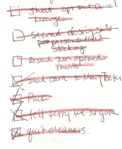
I used that system for a long time. It has worked. notebook3-linethru I can generally flip thru the pages quickly and find what I need.notebook3-crossout
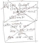
I cross out the stuff that’s done. Or draw a big box around a group of things and put a big X across the middle.

But sometimes stuff just gets lost in the book. Or I spend too much time paging thru to find what I’m looking for. And then… Oh, look, a chicken!

Computer Lists: Lost in the ether

I use my computer’s calendar to keep track of events and contact info, so I don’t need to write that in a book. But the “To-Dos” are harder.

If I keep the list in my computer, I’ll probably never see it. So I need to write it down on paper (that I can find again!)  I’ve tried ToDoist (you have to sign up) and Google Task list, to name a few.  None have really helped me see what I need to do next.

Bullet Journals: Is this the one true way?

I’ve been playing with the idea of using a bullet journal after Joe Casabona, at WordCamp Scranton, suggested it as a great way to use the (beautiful!!) speaker gift notebooks.

The instructions seem a little overwhelming (Like David Allen’s rules).

However, today I stumbled on a revised notion of tabs and dots.

Everybody gets the notion of tabs.  Post–its are great for tabs because you can easily move them around. These heavy duty ones are great, but the regular small size post-its, stuck on upside down so the non-sticky part sticks out, work pretty darn well also.

But the dots are brilliant!

dotsFold over colored stickers on the edges of pages to signify pages that go together. Red for food journal pages, green for things you just want, blue for gift ideas. You get it, right?

Use those big ¾” colored dots (these 1 3/8″ x 1/2″ rectangular stickers seem better. More room to write on them what they’re signifying.)

Marking a collection of pages on the edge and there’s a much greater chance that I’ll be able to find those pages when I’m looking for that content.

Have you used Bullet Journals? Have you found a way to make the process simple? What’s been working for you?


Updating iPhone Apps

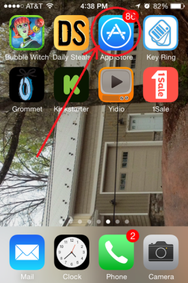
Find the App Store icon and click on it.

I posted a link to this article on Social Media Examiner  on my Facebook page.

I think the first of the ways is particularly cool so I said so on Facebook

My first friend asked: “Great.. How do I update to the latest Facebook App?”

Pretty basic question.
But I have learned that if I GET it once at least 3 other people are wondering the same thing.

So here’s how (complete with my own phone screen shots!)

Find the App Store icon and click on it. Looks like a big A and I circled it in the screen shot at the right.

Please don’t hate me because I have 86 apps to be updated. (That’s what that little 86 means in the red circle)  There are excuses and reasons.. but please don’t ask about them.

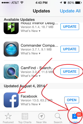
On the next screen, click on the  UPDATE button with the arrow that’s circled in the lower right of this screen (below).

photoThen scroll down til you find an app you want to update.

We’re talking FaceBook here.. but it could be any APP  and it could be ALL apps. (Yep, if there are 86 you could be scrolling a while. OR you could choose the UPDATE ALL in the upper right corner, that I did NOT cirlce)

I already updated my FaceBook app. (na na na)  So the button at the right says OPEN.

But if I hadn’t it would say:  UPDATE

Click that and then wait…. a while.

When the button says OPEN, you’re good to go.


Why do you need a new website?

Let’s pretend you wake up one morning and decide you want a new website.

Curious Monkey asks whyBut here’s the question: Why?

Maybe you finally figured that the site you made in 1999 is a little out of date and you want to fix that. That MIGHT be a good reason. But if your website is doing what you want it to do, then maybe “change” isn’t enough of an answer. After all, the Marlboro Man hasn’t changed much in more than 50 years!

“Why” is a big question.

Is your website doing what you want it to do? Do you know what you want it to do? Do you know what you have to do to make that happen?

“If you’re stuck, throw some money at it.” That’s what my friend Leslie says.

But if you’re not independently wealthy, that might not be a good idea. And even if you are, it’s probably not a good idea.

You have to know what you want your site to do for you and for your visitors.
Your web developer should not be the one to decide that for you.

garage framingSay you get a contractor to build a new garage. You have to plan what you want to do with it. What should be different from the one you have? And even though the men doing the work swear it’s reason enough, bigger is not the only criteria.

We thought about the one we’re building and planned it.

We made sure there is capability for plenty of outlets, put windows in the wood shop and the lift bay, but no windows, besides those in the door, in the general garage area. We continue to think about it as the process proceeds.

Your website is no different. What do you want to have happen there?

  • Should people buy something?
  • Be educated about something?
  • Sign up for a newsletter? (Do you know what the purpose of that is? That’s a conversation for another day.)
  • Do you want them to return time after time?
  • Or do you just want them to see that you really exist and do not have two heads?

You can surely find someone to redesign/rebuild your site, make it more up to date, add features you didn’t have before like maybe a way to signup for a newsletter, add google analytics and links to social media.

If you’re not clear about what you want, two things happen.

  1. You’re at the mercy of your web developer and what s/he thinks you should have.
  2. And then, when you don’t like what s/he does, you’re both in for endless tweaks and twists. That makes the process tiresome for both of you (at best) and costs you more money.

In the end this is all about communication—between you and your visitors and then between you and your designer.

Think about how you want to talk to your visitors. Conversationally? Technically? Formally? Any answer can be right but you must decide.

People need to know you before they like you. Then they have to like you before they trust you enough to give you money.

If you need help with the writing, ask for it. A developer should have at least one colleague who can help with that.

Why do you need a new website?
To realign your site with your message.

But before you start, you have to know what you want people to do when they visit. Only then can you help them get on the track that leads where you want them to go.

Make sense?

How not to have a free event

This week I got an invitation, from someone I respect—who I’ll call Gene—to attend a telesummit where she was speaking on a topic of interest to me.

I clicked through using the link in her email.

The first time I clicked it, the link was just wrong. It went to the website of the woman holding the event (not to Gene) where I couldn’t find anything about the telesummit.
So I wrote to Gene and asked.

She sent a new email to me and everyone else on her list (appropriately by blind copy) with the correct link and an apology. (Great. Thanks.)

Finally I got to the home page of the event which bragged:

AND! IT’S ABSOLUTELY FREE

After entering my contact info, I got the standard message to confirm my request.
No problem.
But no confirmation came.

I signed up three times before I got the confirmation email.
I dutifully accepted that and jumped to the page about the event where:

I find more more crap about what’s coming.
(Notice I’m getting a bit perturbed?)
But still no schedule.
No idea what the speakers are talking about.
No info about how to call in and listen.
No nothing.

EXCEPT a place to sign up and PAY.
(Do you think she thought I missed that part above about: ABSOLUTELY FREE?)

I checked my email again and found a new email from the event leader with a link to the “details” for the summit. (Finally.)
In her defense, it did include the dial-in info, dates and general times of the calls. But it did NOT include the times of each talk.

It was just a list of the speakers, with their lovely pictures, bios and links to their webpages. And STILL NO SCHEDULE.

Boy, this woman lost my interest (i.e. respect) in what she’s presenting and then too, by association, have the rest of the speakers.

noticeofrant

Now I know  I’m just getting pissy here. But let me look past the general event problems to general site problems. (I am, after all, a web developer!)

Some of the speakers’ bios have bold words, some do not. Some include logos, others do not. It looks very haphazardly put together.

Each of the speaker’s bio blocks had their name at the top, as would be expected. But the names were all underlined like they are links. And they are not links.

Underlining is NOT NECESSARY on the web (unless you’re using it to show a link).
It does NOT make people pay more attention.

In the very dark ages when we used typewriters, underlining (or all CAPS) was the only way you could make text stand out. And it was a pain to add to the copy. But now you can use different colors, or fonts, or weight to show importance.

endofrant

Look, I absolutely understand that mistakes happen. I do not mean to be hypercritical here.  But there are so many problems with this invitation that it leaves my trust bucket with a big hole in it.

If I were a speaker in the event, I know I’d be pissed.

A BIG part of putting together an event is paying attention to hundreds of details.

Testing links and checking content for consistency are a huge part of what gives a person credibility on the internet. If you can’t get the details of your own project straight, why should I trust you with my time or money?

You can’t do it quickly unless you were somehow born knowing how to do it. And that takes a LOT of experience.

Get someone to test your links, to step through your steps. Ask someone new (NOT the person who wrote the content) to read it all and see if it makes sense.

How do you insure that you don’t make too many mistakes?
(and, for you, what exactly are “too many?”)

If you’ve got other ideas, please share them in the comment section below. I’m always looking for ways to strengthen my technique.

(PS: I will still be attending Gene’s talk. I still want to know what she has to say. But I surely will not be trying to figure out what any body else is talking about. It’s just too hard!)

What did I do wrong? Does my website suck?

angry kidI have been following a conversation about hate mail: what to do with it, how to mentally process it and how to get over it.

When I started making and selling art work—way back in the freakin’ 70s! (Yes, I am that old), at my very first show, I heard a little girl who was standing in my booth with her mother say, “Oh, Mommy, let’s go look at something pretty!”

Another favorite comment was from a man who sort of shouted over his shoulder as he passed by, “They teach guys in prison to do that, you know!”

A thick skin is required to be in any business, especially one where you do the creating yourself.

None of this is exactly hate mail. But it is, at least, disrespectful. If the comments you get are like those, you laugh them off. Any other response and you look like a dolt.

cloudsIf you’re looking at a cloudless blue sky and somebody says you’re a jerk for not seeing that it is, in fact, black as night, again: Laugh it off.

You might even think, “Good, I’m making some waves. People are noticing me. I’m different. And for my peeps, I’m right.”

But if you’re looking east to a beautiful cloudless sky and the other guy is looking west at an approaching severe storm, laughing it off is not only counterproductive but also really does make you look like jerk.

So here’s what I do when somebody sends sends me an email and says,

Your website sucks!
I can’t find anything that should be there.

Get past the vitriol. Find the important message in that note.

Don’t laugh that off and figure they are blind or stupid.

Skip over the ugly and get some details.

Maybe your site looks great in Firefox but in Chrome there are lots of extra characters. I’ve seen malware actually show up on sites in Chrome when in Firefox and IE they look perfect. (You do test your site on multiple browsers, right? At least: Firefox, Chrome, Safari, IE—new and older versions—and Opera, right?)

An organizer friend of mine says, if you can’t find your caulking gun, you don’t own one. No matter if you really already have 4!

If a visitor can’t FIND directions to your business, then they aren’t there—no matter if they really are included but buried way down below the form on your contact page.

If people complain about your colors, check them out on different monitors. You might be surprised about the differences.

Look, I am NOT saying that you should bend in the wind with every complaint you hear. You cannot make everyone happy. And, in fact, maybe pissing some people off is exactly what you have to do to get your point across or to narrow the field of ALL possible customers to just the ones you want to work with.

But look at the basic complaint offered. Try to see if there is ANY validity to it. If a thank you is in order, send one. But it’s not always a good idea to engage your enemies.

How do you deal with “fightin’ words” from your public? Have you found your tack to be working? Please share!


What do window washers have to do with websites?

The way you do anything is the way you do everything

In the last couple of months I had the windows in my house washed by professionals and I had some landscaping done by … UMM….how to say this and not be accused of slander… a crappy company?

First the window washers

window washer

I live in an old house with 34 windows and 3 doors.  The “old” is important because the windows are big AND have those old triple track storm windows that do not fold in for easy cleaning by beautiful women with perfectly manicured nails!  Cleaning these windows is WORK.

(Did you know you had to wash windows more often than every 5 years.. and that there is no guarantee that they’ll stay clean, no matter how much you pay?  Coulda fooled me.. But I digress.)

I am thrilled and amazed by the results of work by R&J Home Services (if you’re in the Baltimore/Washington area, call them!)

But it’s their process is what’s important here.

Two guys showed up when they said they would—actually,  a little early. They walked through the house and surveyed the project. They helped me move some big furniture out of the way. Then they removed the storm windows, keeping them by the permanent ones so they didn’t get confused.

They put ladders up to the outside of my house (like my father used to), scrubbed the windows with sponges and cleaned the water with squeegees. Then they did the insides, the storms and replaced them all.  It took about 4 hours.

Second the landscaping company

The company owner came and walked around my property in the near dark. I happened to have a scale plot map of the yard and gardens so he told me what he thought I needed, wrote a contract (by hand) at my dining room table and then asked for one third payment. SNAP… just like that he was gone.

He showed up nearly 2 months later than promised with a crew of about 9 guys. They had no visible plan, no copy of my map.  It was 3 days before Christmas, and my substantial number of perennials had died back.  But 9 guys started digging. Then in two days, “Wham bam thank you ma’am. Pay up” and they were gone.  (Need I say that spring was a mess?)

What does this mean to web design and development?

  1. Planning is key to a good experience. Not only did the window job go smoothly, nothing broke and I am over the moon with the results.
  2. Sometimes big is not better.  I shouldn’t have had to (and really couldn’t) pay attention to 9 guys, but neither did the boss who wasn’t even there the whole time.

About the results:

Of the windows: As I notice a one, day or night, (and with 34 that’s pretty much all the time I’m in my house!) I am amazed and thrilled. They sparkle!  Remember the old ad:  “Makes your windows so clean they seem to disappear”?  That’s my windows.

Of my gardens: I can’t really enjoy them anymore. I know stuff will eventually grow in and I am perfectly capable of moving the plants (except the trees) by myself.  It will get better. But I thought paying someone—with a bunch of guys—a bunch of money would give me the results I dreamed of. (Listen to that? Do you hear that buzzer? And the announcer saying “Thank you for playing our game”?)

The window guys listened to me gave me exactly what I wanted, what they promised, and what I thought I was buying. I am sure they have exactly the same process in every house they work in. I don’t care, it works.

A plan for the content of your website is similarly pretty systematic. You need to know who is your ideal client so you can  give the right information to your visitors.  The ad for J&R Home Services showed a picture of a house with a big window and a ladder up to it.  They know who they want to attract!

You need to plan (and write) some content: Home, About, Contact at least! You need a plan for how you’ll keep your site up-to-date and for how you want to grow it and your business.

The landscapers had no plan, just dug and planted.  I’m guessing that’s the way they do all their jobs, too.

A big company with a big price tag does not insure a great product.

Kerch McConlogue, Web developerWeFixBrokenWebsites is a small company. Really it’s mostly just me. I have some colleagues who I trust to help when I can’t figure something out.  But if you work with me, you’ll work with me.  I answer the phone when you call. I read your emails. And if something’s not right, I fix it.


All about the trade show display… or 10 easy steps to a better one

After 20 years of selling stuff out of a full sized 10×10 display, table top trade show displays just bug the crap out of me.

Church bazaars (no offense meant) set out tables for people to set out the stuff they made and are trying to sell. Professional craftsmen (and professionals in business) spend time thinking about how to best show what they made. They think about the story they want to tell about their products.

Think Tiffany window display vs. T J Maxx windows

Here are a few things I learned selling from a 10×10 booth:

  1. Your display is not only about professionally-made stand-up banners (and I am not dismissing them). But people will NOT read all that copy. If  I’m standing there, wouldn’t you rather tell me a story about your service and how it can benefit me?  Not stand around waiting for me to finish reading?
  2. Put your sign high enough behind your display so as to be seen from the end of the aisle. Why?
    Nobody can miss this business name from the end of the row!
    1. If the sign is hanging on the front of your table, people crowding in front of your booth hide your name with their knees. If it’s high, they can look up and see your name without stepping back to read it. (Allowing/encouraging stepping back signals it’s ok to leave)
    2. The “be backs” (people who tell you , “I’ll be back later”) can look down the aisle and find you.
  3. table legs
    This kind works. Other shaped legs don’t.

    Drape your table to the floor. It’s not only hiding what visitors shouldn’t see, it’s also about presenting a uniform clean front view.

  4. Raise your table to counter height so people—especially vain women who don’t’ like to wear their glasses—can see what’s they’re looking at. An easy way to do this is to carry with you 4 pieces of PVC pipe about 14″ long that you can slip over the table legs (IF they have those U shaped legs like the table shown. It won’t work on the legs that are slanted)
  5. Bring something to change the heights of stuff on your table. Covered cardboard boxes (with something heavy inside) allows you to make important stuff higher than the rest of what you’re showing.
  6. Bring flowers or a plant. Have a bowl of candy. Don’t make a candy display that people are afraid to disturb. Get a pretty bowl they can stick their hand in and take a piece or two. Flowers are pretty and attract the eye. A bowl of candy gives a person a reason to stay and talk. People get embarrassed grabbing your candy and then walking away.
  7. If you can have lights (which is less likely at a table top kind of event than at a pipe and drape event) don’t skimp! No lights means no one is home so there’s no reason to stop and look.
  8. Don’t sit behind your table. It’s a barrier between you and your visitors. If you must have a chair (and I am not arguing for standing all day!) bring a tall, bar-height director’s chair.People don’t want to think they’re putting you out by asking you to stand. And why would you want your customers to look down on you?
  9. And perhaps most importantly, think about how people will look at your booth. They won’t see it all at once. They’ll see a piece, a piece, a piece.Think about the story you want to tell when someone stops.
  10. Never start with a question that can be answered “no.” For example: “Can I help you?” leads to “No, thanks, just looking.” And now you have to overcome that negative to get to a positive. How about: “Can I tell you a story about my product/service?” A small first agreement leads to later bigger agreement and sale. Once you know the story you can tell it over and over and be confident. Even if it bores YOU to death, each new visitor will hear it for the first time.

If you’re looking for ideas, visit any high end craft show and pay attention to the booths. (It’s a cheaper experience that way, but the craftsmen might not like it much!)
[kerch]

6-year-old’s Marketing Video… Beautiful!

I feel like I must be a hundred.. but back in MY day, the Boy Scouts sold light bulbs!  THAT was useful.  My dad would keep a big list all year and then get them from a neighborhood kid.

Now, at least here in Baltimore, they’re selling popcorn.

A friend of mine has a 6 year old son who is very proud to have just joined the cub scouts. His den is selling popcorn. “He” wrote an email to his friends and relatives (using his “daddy’s email”) to ask them to buy popcorn.

OK., that’s pretty standard fare. And pretty easy to ignore if you are not ACTUALLY the grandmother (which I am not).

However, it looks like the scouts have upped their game for selling stuff because now using the link in Jack’s email, I go directly to a page which gives him the credit when somebody buys something. (Only problem here is I know the kid as Jack, but his real name is Jonathan.. and that was a bit confusing. Particularly as the picture on the page isn’t Jack).

But I digress.

Here’s the really cool part!
Jack made his own video to sell the popcorn.

And THIS, I am quite sure, he did on his own. The video (just a minute and a half) is a riot sure to impress not only grandparents but friends of his “daddy’s” as well.

It’s short. And feels like marketing genius to me. Only thing I would have suggested, is to put the video link up higher in the letter. And make some reference in the video to the cost of the popcorn and where to find the link to buy the it.  But hey, there’s always next year.

But buy some popcorn from this kid today! The fund raiser is over the end of September.